Cover Story Catastrophes: The British DVD Artwork Disasters That Still Spark Collector Fury

The Gallery of Horrors
Step into any serious British DVD collector's den, and you'll likely hear the same refrain: "Judge a film by its poster, not its cover." This wasn't always necessary advice, but decades of questionable decisions by UK distributors have created a parallel universe where beloved classics are wrapped in artwork so offensive it borders on vandalism.
These aren't minor aesthetic quibbles – we're talking about cover art catastrophes that fundamentally misrepresent films, mislead consumers, and in some cases, completely destroy the visual legacy of cinematic masterpieces. The wounds run deep, and for many collectors, certain distributors remain permanently blacklisted for their past transgressions.
The Celebrity Face-Lift Epidemic
Perhaps no trend has generated more collector bile than the practice of slapping contemporary celebrity faces over original theatrical artwork. The logic seemed sound from a marketing perspective: recognisable stars sell units. The execution, however, often resembled digital vandalism.
The most notorious example remains Entertainment in Video's 2003 release of "The Italian Job" (1969). Michael Caine's 1960s face was digitally imposed over the original poster's stylised Mini Cooper imagery, creating a Frankenstein's monster of marketing that pleased neither nostalgic collectors nor new audiences seeking the remake.
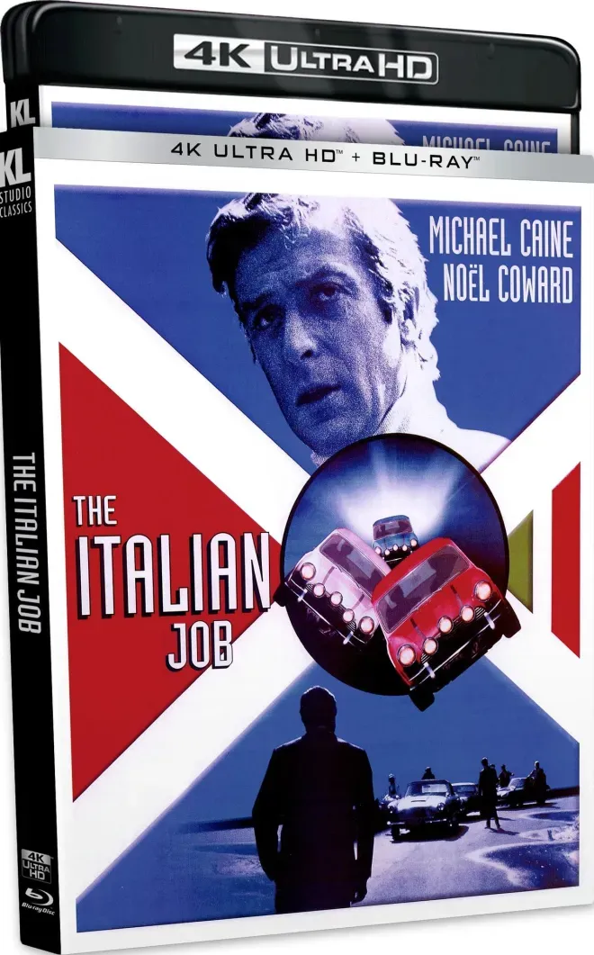 Photo: The Italian Job, via cdn2.highdefdigest.com
"It was like watching someone vandalise the Mona Lisa," recalls Manchester collector Patricia Henley. "The original poster was iconic – part of British cinema history. Slapping a giant Michael Caine head over it showed complete contempt for the film's visual legacy."
This wasn't an isolated incident. Throughout the early 2000s, distributors routinely prioritised celebrity recognition over artistic integrity, leading to a generation of releases that collectors now actively avoid.
The Photoshop Massacres
If celebrity face-lifts were surgery, then the photoshop disasters of the mid-2000s were full-scale amputations. British distributors, armed with early digital design tools and apparently unlimited confidence, began creating original artwork that defied both taste and logic.
The 2004 DVD release of "Withnail & I" by Universal Pictures UK remains a textbook example of how not to represent a beloved British film. The original poster's subtle, character-driven imagery was replaced with garish digital collages featuring floating heads, neon fonts, and colour schemes that suggested a completely different genre.
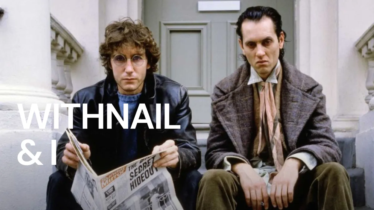 Photo: Withnail & I, via facts.net
"They made it look like a bloody romantic comedy," fumes London collector James Wright, who owns three different international editions purely to avoid the UK artwork. "Withnail is gritty, authentic, quintessentially British. The DVD cover made it look like something starring Hugh Grant."
These photoshop experiments often revealed a fundamental misunderstanding of the films themselves. Horror classics received rom-com treatments, intimate dramas were given action movie makeovers, and art house films were wrapped in designs more suitable for direct-to-video thrillers.
The Misleading Marketing Minefield
Some cover controversies transcended poor taste and entered genuinely deceptive territory. British distributors occasionally used images from completely different films, featured actors who weren't even in the production, or created artwork suggesting entirely different plots.
The most egregious example involved a 2005 release of "The Wicker Man" (1973). The distributor used promotional stills from an unrelated contemporary horror film, creating expectations that the classic British thriller couldn't possibly meet. When confused customers complained, the distributor's response was typically dismissive: "Cover art is marketing material, not documentary evidence."
 Photo: The Wicker Man, via www.vintagemovieposters.co.uk
This attitude infuriated collectors who viewed DVD packaging as cultural preservation. "These aren't just products," argues Edinburgh collector Margaret Foster. "They're historical documents. When you misrepresent a film's visual identity, you're rewriting cinema history."
The Great Import Rebellion
Frustrated by domestic distributors' repeated artwork atrocities, many British collectors began importing DVDs from territories with superior packaging standards. This wasn't merely aesthetic snobbery – it was a full-scale rebellion against local industry practices.
France's StudioCanal releases, Germany's Arthaus editions, and America's Criterion Collection became the gold standard for collectors who refused to compromise on packaging quality. The irony wasn't lost on anyone: British films were often better represented by foreign distributors than domestic ones.
"I spent more on shipping than the actual DVDs," admits Newcastle collector Robert Khan, whose shelves feature predominantly imported editions. "But I couldn't live with those awful UK covers staring at me every day. My collection is my pride and joy – why would I fill it with embarrassments?"
This import trend created a peculiar situation where British collectors were actively avoiding British releases of British films, purely due to packaging concerns.
The Streaming Déjà Vu
As physical media declined and streaming platforms rose, many collectors hoped the cover art controversies would become historical footnotes. Instead, streaming services have simply transferred the same sins to digital thumbnails.
Netflix's algorithm-driven artwork, which changes based on viewing history, has created new forms of visual confusion. Classic films appear with different images for different users, destroying any consistent visual identity. Amazon Prime's thumbnail choices often prioritise contemporary relevance over historical accuracy.
"It's the same problem, different medium," observes film historian Dr. Andrew Mitchell. "The technology changed, but the fundamental disrespect for cinematic visual culture remains constant."
The Collector's Revenge
Modern collectors have developed sophisticated strategies for avoiding artwork disasters. Online communities maintain detailed databases of cover art quality, warning fellow enthusiasts about particularly offensive releases. Some collectors create custom sleeves, printing original theatrical posters to replace distributor artwork.
The boutique label revolution has partly addressed these concerns. Companies like Arrow Video, Indicator, and Eureka Entertainment have made superior packaging a core selling point, often featuring multiple cover options or reversible sleeves with original artwork.
"The boutique labels understand that packaging matters," explains Bristol collector Helen Davies. "They're not just selling films – they're selling experiences, memories, cultural artefacts. The cover art is part of that package."
Legacy of the Cover Wars
The DVD cover art controversies have left lasting scars on British collecting culture. Many collectors remain suspicious of certain distributors, automatically assuming inferior packaging quality. The phrase "original artwork" has become a selling point, highlighting how far standards had fallen.
More positively, these controversies have elevated awareness about visual culture's importance. Modern collectors are more discerning, more vocal about packaging quality, and more willing to vote with their wallets when distributors fail to meet expectations.
The battle for better cover art continues, fought daily in online forums, collector communities, and purchasing decisions. Each awful cover serves as a reminder that in the world of physical media, first impressions aren't just important – they're permanent.