The Gallery Wall That Nobody Planned
Walk into any serious British DVD collector's home, and you'll notice something remarkable: their shelves don't just house films and television programmes—they showcase an unintentional gallery of commercial art that tells the story of how Britain saw its entertainment differently from the rest of the world.
Whilst American releases screamed with explosive action shots and European editions favoured stark, arthouse minimalism, British DVD covers carved out their own visual territory. These weren't just packaging decisions—they were cultural statements that reflected how UK distributors believed their audiences wanted to connect with beloved stories.
When Britain Went Its Own Way
The divergence began in earnest around 2001, when DVD penetration reached critical mass in British households. Distributors like Momentum Pictures, Optimum Releasing, and even major players like Warner Bros UK started commissioning entirely separate artwork for their region 2 releases.
Take the 2003 UK release of 'Lost in Translation.' Whilst the American sleeve featured Bill Murray and Scarlett Johansson in Tokyo neon, the British edition opted for a dreamy, watercolour-style illustration that captured the film's melancholic mood through soft pastels and hand-drawn typography. It was quintessentially British in its understated approach—emotional without being sentimental, artistic without being pretentious.
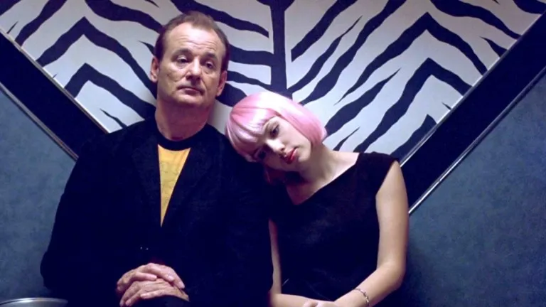 Photo: Lost in Translation, via www.denofgeek.com
Collector Sarah Mitchell from Manchester has spent fifteen years tracking down these UK variants: "The British covers told you something about how we processed these stories differently. We weren't afraid of quiet moments or subtle imagery. Our covers trusted the audience to understand nuance."
The Artists Behind the Sleeves
Many collectors don't realise that British DVD artwork often came from the same design studios creating film posters for London's West End or album covers for independent record labels. Studios like Stylorouge and The Partners brought a distinctly British sensibility to home video packaging—one that valued typography, negative space, and often, a touch of irreverent humour.
The 2004 UK release of 'Shaun of the Dead' exemplifies this approach perfectly. Rather than copying the theatrical poster, the DVD featured custom illustration work that played with British cultural touchstones—cricket bats, pub signs, and suburban semis—creating artwork that felt authentically local whilst remaining universally appealing.
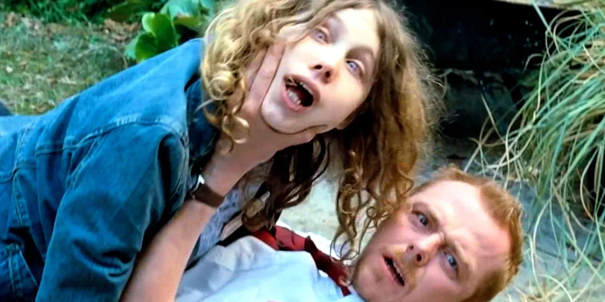 Photo: Shaun of the Dead, via static1.srcdn.com
Regional Quirks That Became Cultural Markers
British distributors developed fascinating visual shorthand during the DVD boom years. Period dramas inevitably featured sepia tones and elegant serif fonts. British crime films got gritty, high-contrast photography with bold sans-serif typography. Comedy releases often incorporated hand-drawn elements or deliberately amateurish design touches that suggested British self-deprecation.
These patterns weren't accidental. Focus groups and market research revealed that British consumers responded differently to visual cues than their continental or American counterparts. We preferred suggestion over statement, wit over bombast, and craft over computerised perfection.
The Collector's Perspective
Today's serious collectors actively hunt for these British variants, often paying premium prices for what were once standard high street purchases. The 2005 UK special edition of 'This Is England' commands £40-60 on the secondary market, not for its content, but for its striking cover art that features Shane Meadows' own photography combined with custom typography that perfectly captures the film's working-class authenticity.
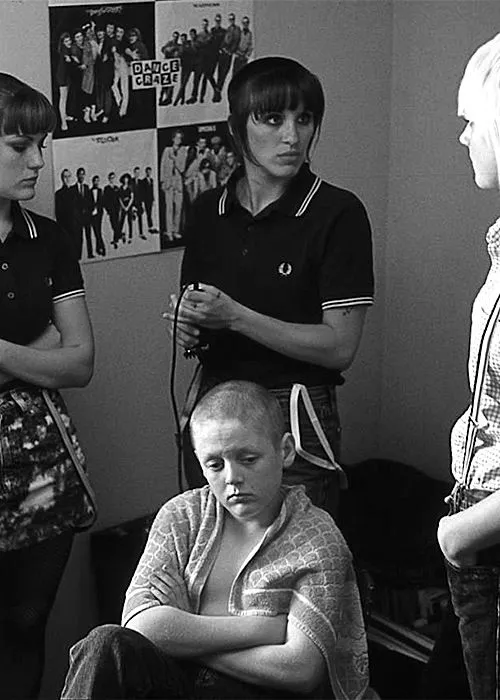 Photo: This Is England, via i.pinimg.com
"I've got the same film on American, German, and British releases," explains collector James Wright from Leeds. "The content's identical, but the British cover tells a completely different story about how we understood that film culturally. It's like having three different interpretations of the same piece of music."
The Lost Art of Physical Persuasion
What made British DVD artwork particularly special was its physical context. These covers needed to work in Woolworths, HMV, and independent shops across the country. They had to catch attention under fluorescent lighting, communicate genre and quality instantly, and compete with dozens of other releases on cramped shelves.
This created a unique design challenge that streaming thumbnails simply don't face. British designers developed sophisticated visual techniques for making their covers readable and appealing in physical retail environments—techniques that now seem almost quaint in our digital age.
Preserving a Visual Legacy
As streaming dominates and physical media retreats to specialist retailers like Beck's DVDs, these British cover variants have become inadvertent time capsules. They document not just what we watched, but how we wanted to be seen watching it.
Smart collectors are now treating these covers as legitimate collectibles in their own right. Some frame particularly striking examples as wall art, whilst others carefully preserve mint condition sleeves alongside their discs, recognising that these designs represent a specific moment when British commercial art reached an unexpected peak.
The irony is delicious: what began as disposable packaging designed to shift units has become a cherished record of British visual culture. In our rush toward digital convenience, we've accidentally created a new category of collectible art—one that captures how Britain saw itself reflected in the stories we chose to own.